Tuesday, October 27, 2009

Depth Preception

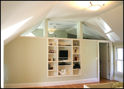
This is a picture that I found using google image search under the term of "illusion of space". They use mirrors on the 3 ceiling windows that creates a illusion that gives out a sense of extra space. They are actually just mirrors' reflection from the living room ceiling. The room that you see on the right hand side is just a coat closet. The mirrors' reflection also extends the linear perspective from the horizon line. It makes the ceiling seems to be continued to the next room, but actually 2/3 of space you saw in that room is just solid concrete. The TV and the displays is using visual element of familiar size to compare with the everyday objects. It gives you a sense of scale to compare with the environment. The small and narrow display cabinet gives out a feeling of huge extra space if you compare to the huge unused wall on the left of the cabinet. Discrimination of perception plays a key roll in this photo, which it's widely use in creating of space in this case.
source image: http://cache.boston.com/bonzai-fba/Original_Photo/2006/11/21/1164218134_3869.jpg

Tuesday, October 20, 2009

Tone & Color


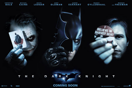
This Dark Knight poster uses a darker tone. The intensity of light is very limited. The light only presence around Joker, Batman, and Two Face's faces. The light goes around their faces and reflects very minimal of light. We see this poster is dark because it overlaps what is light.
I find Two Face very interesting. He is holding his campaign buckle in a circle shape. The circle represents endlessness, warmth, and protection. This fits his roll as a city attorney which protect his people by fighting crime. Although later, he is all changed to someone else.
The hue in this poster is rather simple but good. Batman is in black overall. Black has a meaning of mystery and power that fits his roll in the movie. Joker has the color of red on his lip and the card that he is holding. The color of red Red is the color of fire and blood, so it is associated with energy, war,danger, strength and power. Red also represents love, but definitely not in Joker's case.
The color of red, white, and blue has the meaning of liberty and freedom. You can see this on the campaign buckle that Two Face is holding. It goes well with the shape of circle that has the meaning of protection. And on top of that, the circle represents endlessness that illustrates the point to that we all hope freedom and liberty can be everlasting.

Tuesday, October 13, 2009

Product Design - Magic Wheel


This cool product is called the Magic Wheel. I also included a picture if you wonder how to ride this thing. The color or so called the hue that most eye catching is the red located in outer part of the frame. Red is one of the three primary colors in the color structure. The red that they use had very bright tone and close to pure red in the color saturation that contains minimal of grey. The wheel in circle shape is one of the three basic shapes. The circle shape represents endlessness, warmth, and protection. In this product, you can sense the scale between the front wheel and the rear wheel. The rear wheel is so small that you can tell the front wheel is way bigger than the rear. It clear demonstrate the face that there can be no large without small.

Monday, October 5, 2009

Syntactical Guidelines

Let's talk about the bad one first. This is a image that I found on the web. It is obvious that this photo was shooting on a PC or TV screen. The screen in the photo cause this whole picture had a sense of imbalance. It made the two characters not level to each other just because it has a crikey screen frame.
Source: http://xbox360media.ign.com/xbox360/image/article/854/854140/apb-20080221092331297-000.jpg
The image that I found on Google that illustrated stress. I think it is a very good demonstration of stress because it used the syntactical guideline of stress very well. The diagonal of table setting and the off-center marker board showed the syntactical guideline of stress very well. Also note that man in this photo was not balance as well that his hand was touching table to find a balance for himself.


Tuesday, September 29, 2009

Visual Language


A picture from a friend's wedding on Facebook. They were posted very close to each other just like a family photo. It showed that they should be very close friends especially the two ladies in the back. You can tell the two in the front were not that close compare to the two ladies in the back because there were some distances in between them. This imply the rule of proximity in visual language. They were all facing the camera and stay close together. The lady at the very end has the highest visual hierarchy because the color of her dress that stand out then the rest. The environment also has profound control on how we see on picture. In this western banquet environment with fine dinning sets and white table cloths, our brain automatically tell us this is some nice event probably a wedding or a corporate dinner.

Sunday, September 20, 2009

Visual Thinking Research


David: D
John : D
Answer: E

We both thought is adding the square in first two squares, and subtracting the last two squares. It didn't make any sense and we picked the closest answer, which was D.


David: 17
Vicky: 21
Answer:20
I didn't count the tail triangles correctly on the mid section and end section of the tail as if you broke them down in smaller pieces that still count as triangles . Vicky counted top to bottom and adding up 21 triangles. She said she just miss count on the triangles.

Monday, September 14, 2009

feature channels and visual search

This is the Metro Taipei (like Bart over here) in Taiwan, Taipei. Each Line is categorized by using visual research method on colors. Red color is the most obvious color in this map. The one colored in red is the main line in the Taipei Metro. The interesting part is that if today I don't understand Mandarin nor English, will I still able to recognize some information on this map? Probably, yes. The end and start stations are annotated in solid dots, which have the meaning of end station. It is pretty straight forward and clear to understand. The transit stations have higher visual hierarchy than the end/start stations and they are marked like in different symbols and colors, which make them stand out even more so than start/end stations. Image source: http://www.flickr.com/photos/monhsi/1896193715/